One link. Every side of you.
Portfolio, shop, appointments, a new project. One profile link often has more to hold together than it can show. Linknido turns that problem into an in-house FLOMORO product: a customisable link page that brings order without making everyone look the same.
Your bio has one link. Your day doesn’t.
Our projects regularly bring several paths together: a menu and reservations, courses and an info call, a portfolio and a shop. Suddenly the one link in a profile needs to tell the whole story. Another list doesn’t automatically make a good entrance.
So the starting point was never a single industry. Linknido needed to work for people and businesses sharing more than one destination: clear to use, individual in appearance and easy to update when something new arrives.
The working name was FLOMORO Links. A name of its own, a distinct identity and a connected editor turned it into an independent product. The connection to FLOMORO stays deliberately visible.
One system. No uniform required.
A restaurant speaks differently from an academy. A personal brand needs something different from a product. These published Linknido pages show how one technical framework can carry very different identities.
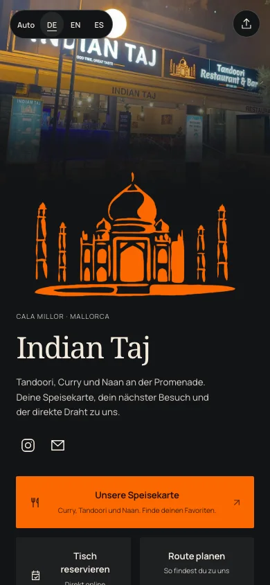
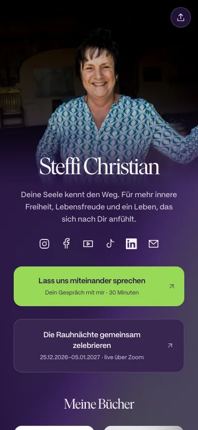
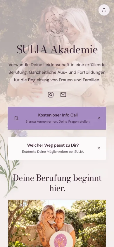
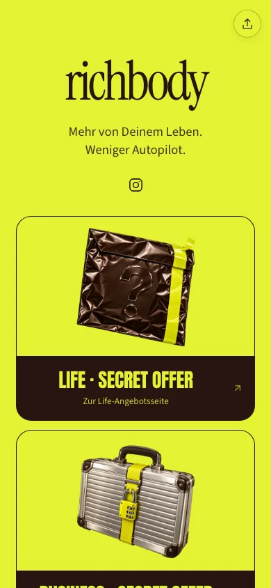
Published pages in their original language. Design and content belong to each project; no claim about bookings, reach or sales.
Many links. One nido.
“Link” makes the purpose immediately clear. “Nido”, the Spanish word for nest, gives it direction: one shared place for things that otherwise live apart. A home for links, without drawing a house and a bird.
The symbol joins two simple shapes. A recognisable silhouette for navigation, favicons and small credits. It doesn’t need to explain every feature to make connection visible.
More personality. Less off the shelf.
The product needs precision. The brand can still feel human. Cream paper, clear dark typography, violet and orange connect the digital interface to a tangible collage world.

Images with a job
Photography, craft and culture stand for the many sides of a person. The collage describes the product’s idea rather than placing a generic 3D world beside it.
Type with a point of view
Uncut gives the big statements character. Manrope keeps explanations and controls calm. Different font families are available for the page you create.
Freedom with a framework
Colours, fonts and link styles are yours to choose. Spacing, focus, contrast and understandable states keep the result usable. Individuality doesn’t need a treasure hunt.
Not just linked nicely. Thought through.
The important design often lives between two screens: what does a visitor see first? When does a change go public? What happens to the QR code already in print?
Content with hierarchy
Simple link rows for direct destinations, image cards for things worth seeing, and tiles for content that belongs side by side. Sections and social icons help people find their way.
Review first. Publish second.
Drafts and published pages are separate. A new idea doesn’t immediately replace the public page. Preview it, then deliberately release it.
Share once. Keep developing.
The page address stays while the content changes. Its QR code remains useful too. New season, new offer, new project: update rather than redistribute.
One address. Content that moves.
Interactive principle example · not saved and does not change a public page.
An idea becomes a working tool.
The actual interface: from the first impression to different page identities and the editor. The demo uses fictional content; the published profiles above really are available on Linknido.
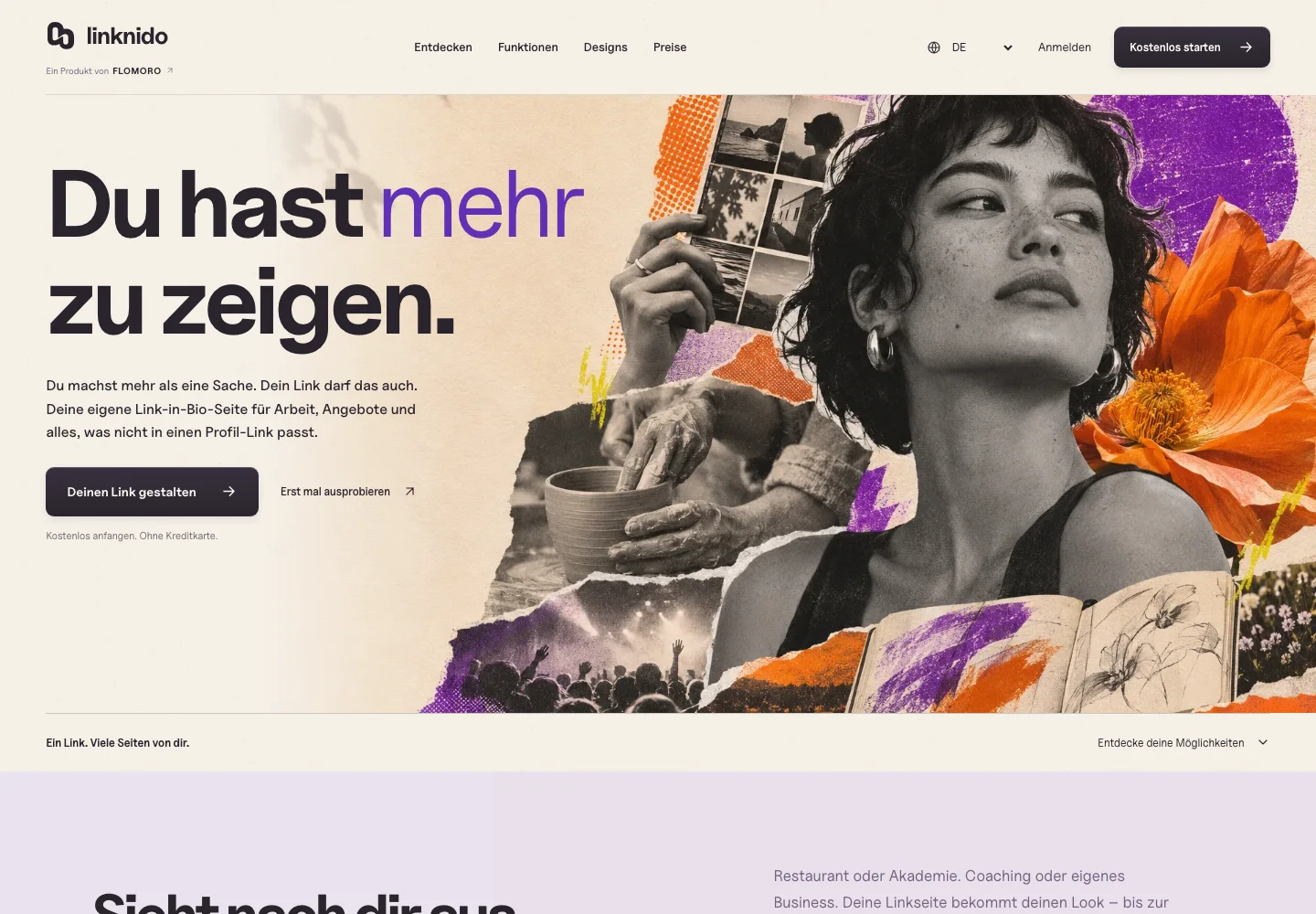
The first impression
The homepage explains the purpose, shows real pages and moves from design possibilities towards an informed decision.
Original captures from 7 November 2026 · German product interface · editor with fictional demo content.
Personal on the outside. Organised underneath.
Creative freedom needs a dependable foundation. The architecture separates what someone may edit, what is public and what is actually measured.
Ownership and publishing
Accounts, sessions and pages live in PostgreSQL in Frankfurt. Server-side ownership checks protect editing and publishing; version checks prevent an outdated draft overwriting a newer one.
Images and analytics
Images are checked, re-encoded and served through a dedicated media path. Analytics counts views and outbound clicks. It does not turn them into sales, reservations or unique people.
Three languages. One product.
German, English and Spanish are part of the interface. The preferred language is selected before rendering. Individual profiles independently retain their authored content.
What exists today. What comes next.
Published pages, the design editor, drafts and publishing, QR export and basic analytics are implemented. The public demo can be explored without an account. Commercial launch, including new accounts, email delivery and paid Pro, is being prepared separately. We make no usage, revenue or conversion claims from the current stage.
From “here are a few more links” to a presence of your own.
Linknido connects product strategy, naming, identity and implementation. The task wasn’t to squeeze as many features as possible onto a small page. It was to turn many possibilities into a clear next step, while leaving room for people who do more than one thing.