Richbody.
A rebrand. No indoor voice.
Richbody has opinions. On good coaching. On running your own business. And on a life that feels richer than “can’t complain”. We’re giving that attitude one coherent presence, from the first line to the final button.
Step into the rebrand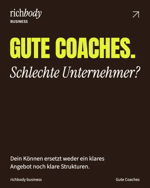
Keep scrolling. The indoor voice ends here.
Positioning · Voice · Identity · Social media · Web
WELL-BEHAVED?SOMEONE ELSE.
Meet Richbody.




The case study, in motion.
Good coaches. Terrible clones.
You’re the coach. And sales. And marketing. And “I’ll just do it myself”. Impressive how many full-time jobs are supposed to fit inside one human.
Richbody’s new Business direction speaks to skilled coaches who want clearer offers, decisions and operations. Life and Academy bring other questions and learning spaces into the same brand. The rebrand’s job: make those directions distinct while keeping a recognisable shared attitude.
So we started with positioning and voice. Yellow came later. Really.
A bit of yellow isn’t an attitude.
Attitude needs a form. Anton makes the point. Instrument Serif asks the follow-up. Source Sans 3 explains the rest. Chocolate, electric yellow and warm paper give three directions one family resemblance, with room to do their own thing.
 richbody
A little shine. No excuse for empty words.
Big mouth. No hot air.
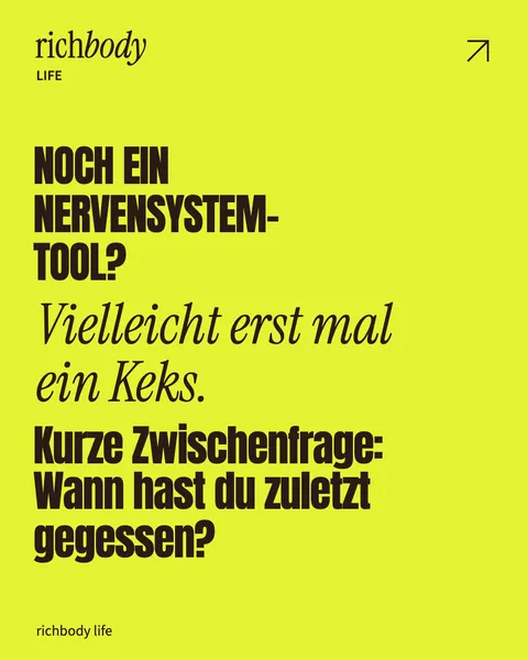
The voice can sting. It also needs a target: the decision postponed for weeks. The offer nobody can explain. The entire internal team of “me, myself and also me”. Recognition earns a question you can actually do something with.
“Beeindruckende Personalunion. Mäßige Arbeitsteilung.”Gone tomorrow. Still in your head.
Stories carry the thought forward. For Life and Academy: a lead-in, a shared post, a follow-up question. For the campaigns: a short invitation of their own. A little more to offer than “new post, please look”. You’re welcome.
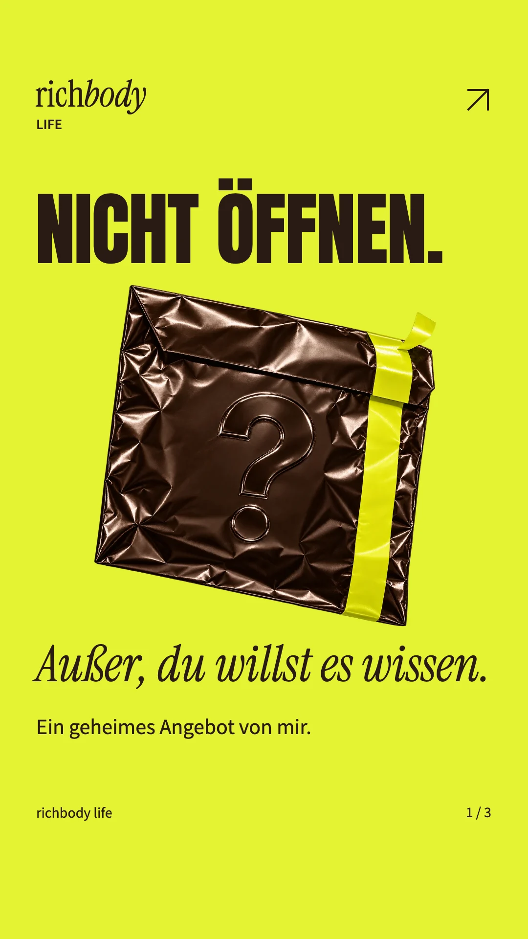
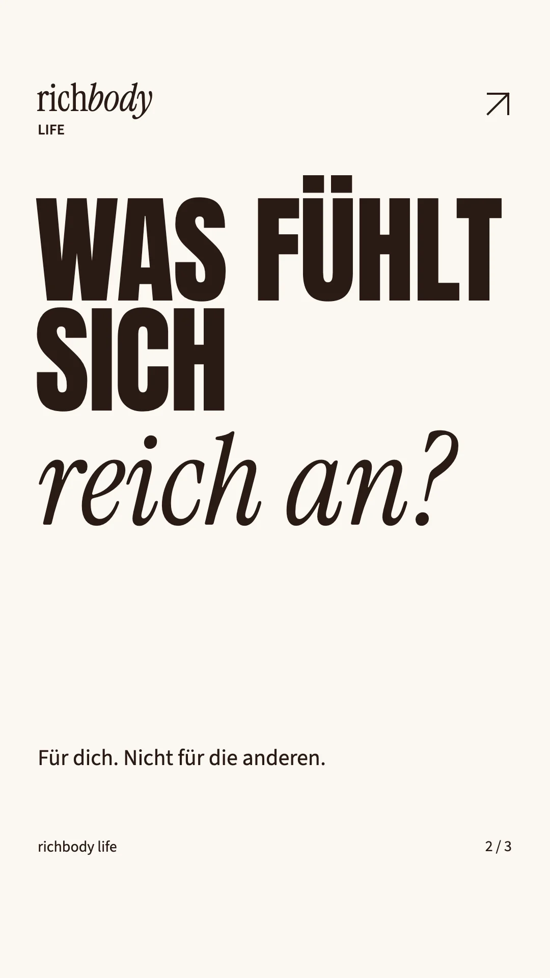
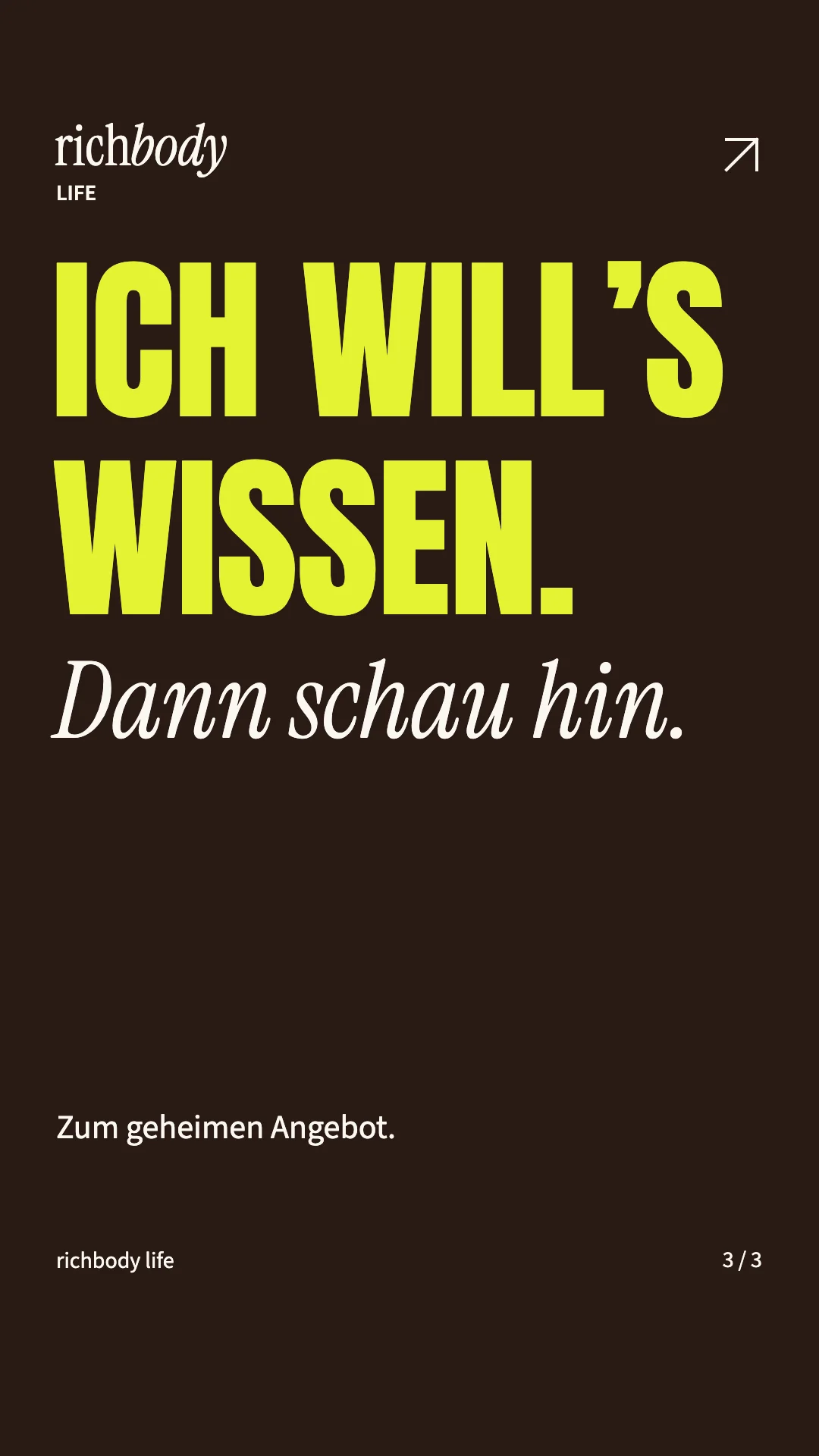
Interactions are local previews. Nothing is sent to Instagram.
Hands on. Layers off.
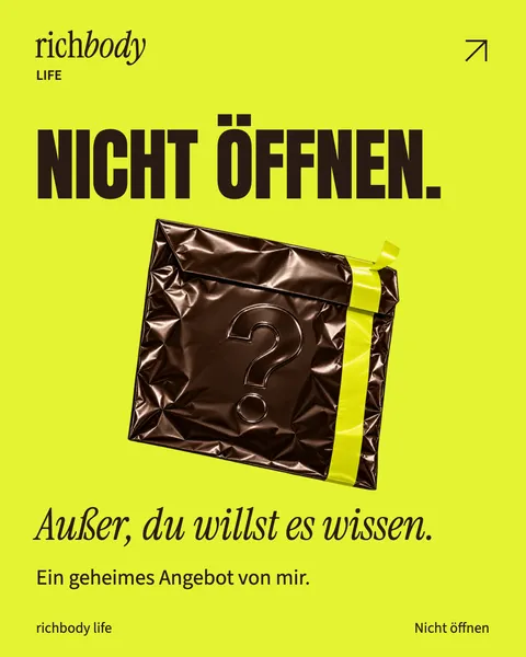
Three pages. Your pick. Business back-up, a secret invitation from Life, or the new Business room. Pick a card for the complete page, with every button, wiggle and peel. Come back for the others whenever you like.
Which one first?
01 — 03Pick a card. Explore the whole page.
Looks good. What does it do?
A clear direction. A presence that follows it through. And work you can inspect for yourself.
Strategy, voice, identity, content and campaign pages connect in the current design. The rollout continues. Claims about reach, enquiries or sales need actual results. Until then, we’ll show the work.
BEING GOOD.SHOULD LOOKTHE PART.
The competition can keep “quite nice”.
Your offer is strong. Your brand says “I made this in a hurry”? We can work on that. Tell us what you do well. We’ll work out how your brand can finally show it.
Enough with quite nice.