From a third-party listing to a place of its own.
We built a small editorial site for the café in Erkrath-Unterfeldhaus: a welcoming homepage, an offer page, the Carlucci story and a practical visit page. Each has a clear purpose and links naturally to the next question.
The idea behind it.
A directory knows where a café is. It rarely explains why someone should linger there. Carlucci’s own site makes the offer, character and visit part of one story.
Eiscafé Carlucci had no dedicated website. A directory profile could name the café, but not give people a proper sense of its ice cream, neighbourhood story or the details of a visit.
For people who …
are looking for a small break in Unterfeldhaus.
need the offering, location and visit details quickly on their phone.
already know the café and should recognise it online.
Four questions, four useful answers
Each page has a job in the visitor’s decision. Together they lead from curiosity to a real visit without inventing an online purchase flow.
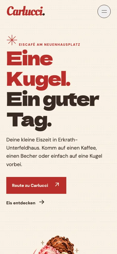
Original German interfaces · captured 31 October 2026
From a first look to a next step.
Why Carlucci?
The homepage pairs atmosphere and offer, then opens clear routes to ice cream, story and visiting. Original illustration gives the café a recognisable identity.
What can I try?
The Eiszeit page uses grouped flavours and filters. Provisional varieties are not described as today’s guaranteed stock.
How do I get there?
The visit page brings address, directions, phone, payment information and common questions together, with direct actions where facts are confirmed.
Who is behind it?
A dedicated story page gives the neighbourhood café a human identity. Specificity earns more trust than generic claims.
A world of its own. With a purpose.
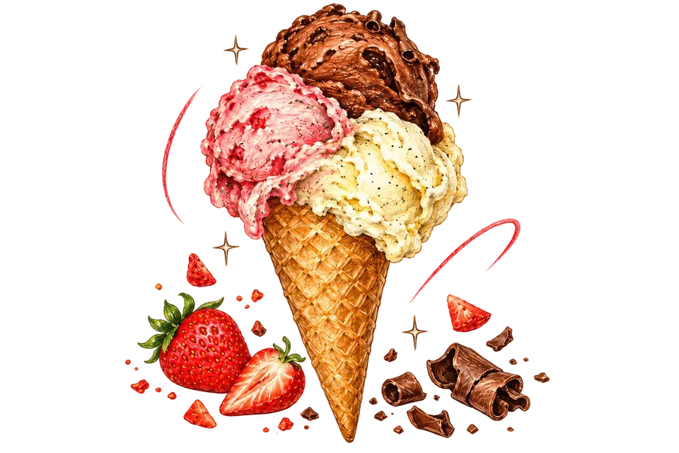
Strong red, compact Dela typography and sketched ice cream turn an information page into a little piece of Carlucci. The drawings are deliberately illustrations. Practical steps stay direct: explore, find the address, open directions.
Conversion here means bringing people in
That is why the strongest actions lead to directions and a phone call. The site answers objections early, loads quickly on mobile and is easier to remember.
- Clear path from offer to visit
- Filterable flavour overview with useful feedback
- Direct maps and phone actions
- FAQ and confirmed details such as cash payment
- Original illustration as a brand world
- Local content, metadata and structure for discoverability
Before / After
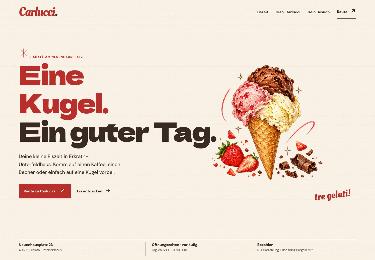
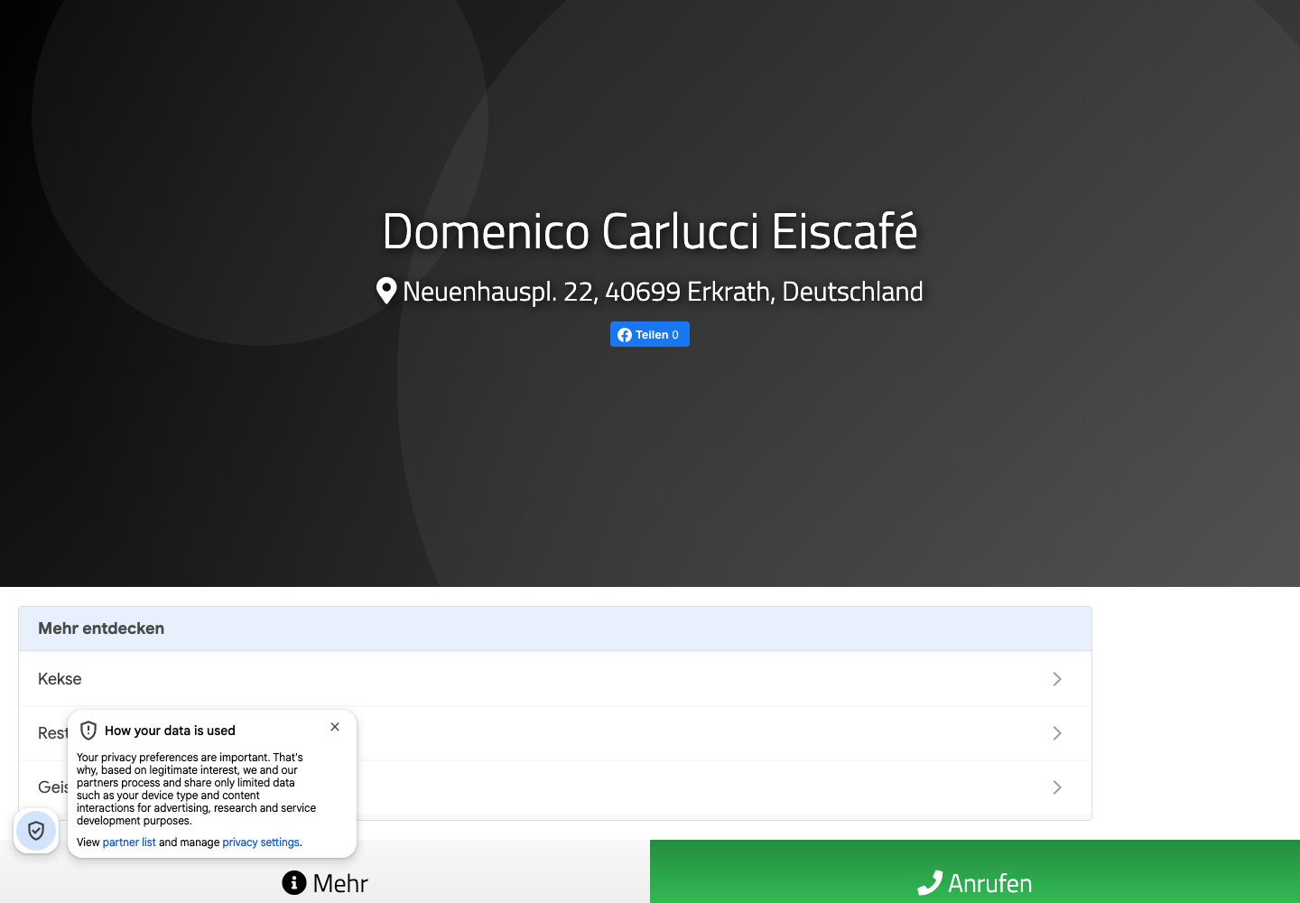
Previous listing: 24 September 2026. New website: 31 October 2026.
Open previous pageWhere it stands.
The designed site is available as a preview. Flavours, hours and remaining owner details still need final approval. Its illustrations express a design direction rather than a verified daily offering.
What it adds up to.
Carlucci has a digital home with its own voice, a discoverable offer and a short path to a real visit. The comparison shows how much more a guest can understand before setting out.
The Carlucci design shows a website of its own instead of only a borrowed profile. The comparison proves a change in presentation, not an unmeasured revenue or ranking gain.