An ice cream café with a website as welcoming as the visit.
We designed a distinct site with a clear route through the menu, Fabio’s introduction and visit details. The pages communicate the café’s character while answering the questions people ask before setting out.
The idea behind it.
The old presence was essentially a listing. An ice cream café sells a feeling too: the cabinet, the terrace and time with family. We gave those things room online.
Antifora’s earlier listing gave the café a web address, but little control over how its menu, atmosphere and practical visit information appeared. A guest had to work harder than necessary to understand what was on offer.
For people who …
want ice cream, coffee or a pause in Unterrath.
want to get to know Fabio’s offering before visiting.
need clear directions while they are out.
From listing to a reason to visit
The new site goes beyond an address. It answers the small questions between wanting ice cream and actually setting out.
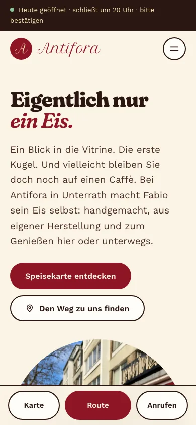
Original German interfaces · captured 31 October 2026
From a first look to a next step.
Arrive
The opening view introduces Antifora’s ice cream, atmosphere and menu. It feels like the café rather than a generic directory template.
Explore the offer
A dedicated menu page lets guests browse sundaes, ice cream and more. Unconfirmed details are not passed off as current prices.
Plan the visit
A visit page, directions, seasonal guidance and visible opening status help at the decisive moment. Fabio’s introduction and handmade ice cream give the place a face.
A world of its own. With a purpose.
Cream, cherry red, rounded Fraunces lettering and small checker accents translate the café into a warm digital atmosphere. The pages tell a visit: choose ice cream, find a seat, perhaps another coffee. Fabio and his handmade ice cream give the story its real centre.
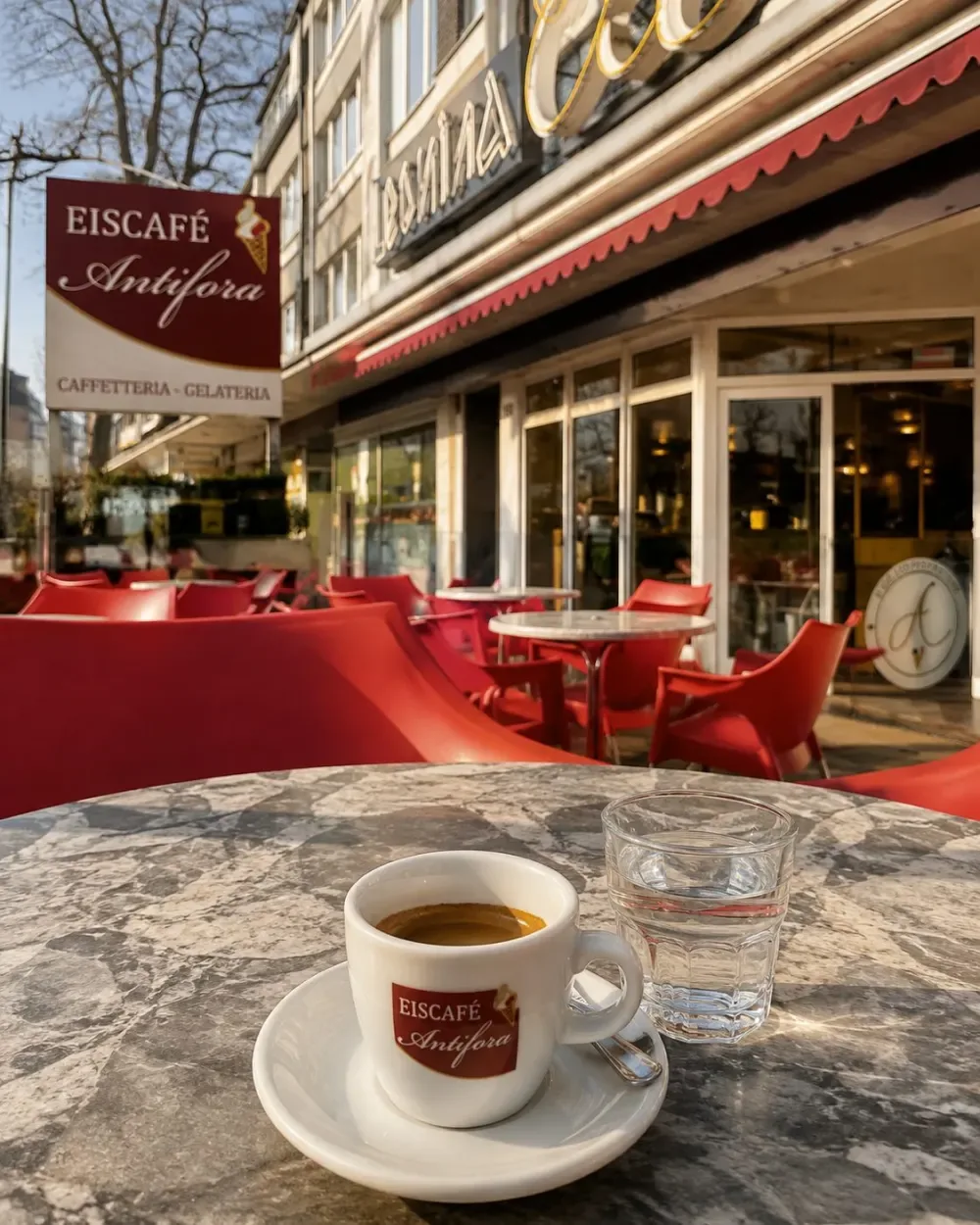
Why this can turn interest into a visit
Atmosphere is paired with useful information. Someone arriving from search or a recommendation finds a next step, not just a gallery.
- Four focused pages: home, menu, visit and about
- Seasonal opening logic and current status
- Short mobile routes to menu and directions
- Semantic copy and metadata with local context
- Lean static delivery without unnecessary runtime
- Honest placeholders until business details and image rights are approved
Before / After
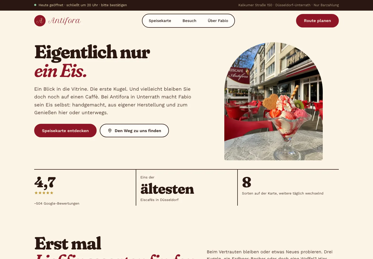
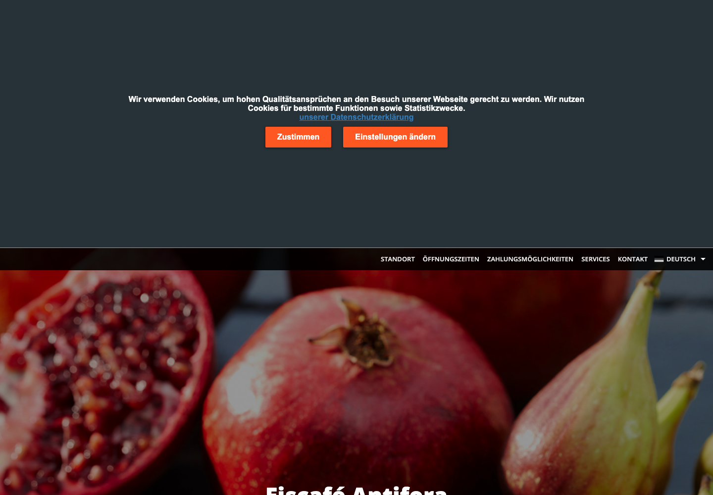
Previous listing: 24 September 2026. New website: 31 October 2026.
Open previous pageWhere it stands.
The site is available as a non-indexed preview. The new menu and Fabio’s feedback are incorporated; remaining owner details, legal pages and new imagery come before final approval. Parts of the current design use labelled illustrative images.
What it adds up to.
The café now has room to tell its own story and answer the practical questions that a listing could not. The comparison below makes the change visible.
The image comparison shows a clear change in presentation. Public search indexing remains off until owner, legal and imagery details are settled; no revenue effect is claimed.